Over half of users left the app within two minutes, which told us they were either frustrated or couldn’t find what they were looking for.
PatPat Search Revamp
Client
PatPat
My Role
Lead UX Designer
Description
PatPat is a curated online boutique of fashionable matching outfits for the whole family to bring the crew together in style.
In this case study, I’ll share my contribution as a contractor to improving the search experience for the PatPat mobile app.

Case study
Our analysis revealed that PatPat search performance was falling short. Collaborating with engineers, our product team gathered data to quantify the issues and confirm the need for improvements.
62
High Bounce Rate on Mobile
18%
Low Search Usage
Only 18% of users actually used search, meaning either they didn’t see it or didn’t think it would help.
46%
Search Drop-off
Almost half of the users who did search gave up after seeing the results page, which meant the results weren’t useful or trustworthy.
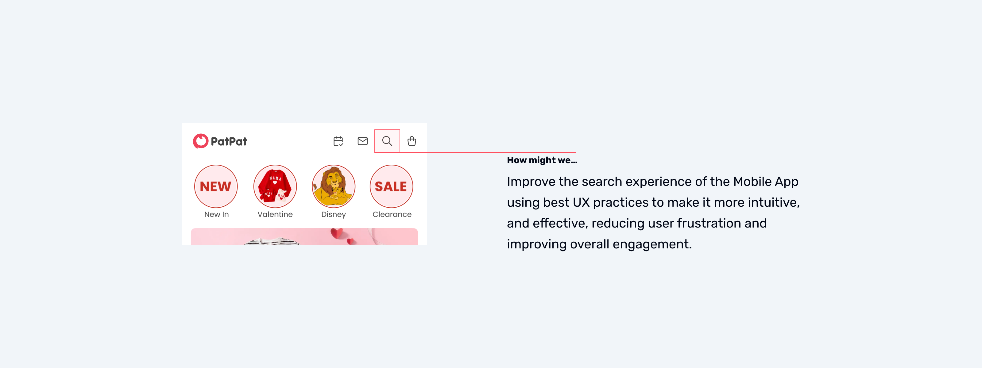
So, The Big Question was: How can we make search easier to use and actually helpful, so people find what they want without frustration?
Research
User Interviews
The data gave us numbers, but we wanted to hear directly from shoppers to understand why they were struggling. I worked with our researcher to run interviews, where people walked us through their experiences and shared what they liked, disliked, and expected.
What Stood Out
- Hard to Find Search Bar — People expected search to be right at the top, but it was hidden among other elements.
- No Search Suggestions — Typing in the search bar felt like guessing, since no suggestions popped up.
- Search Results Didn’t Make Sense — Sometimes the results didn’t match the search at all, making people question if search even worked.
- Missing Filters & Sorting — People wanted quick ways to narrow down results by things like price, size, or category, but those options weren’t available.
Learning from others
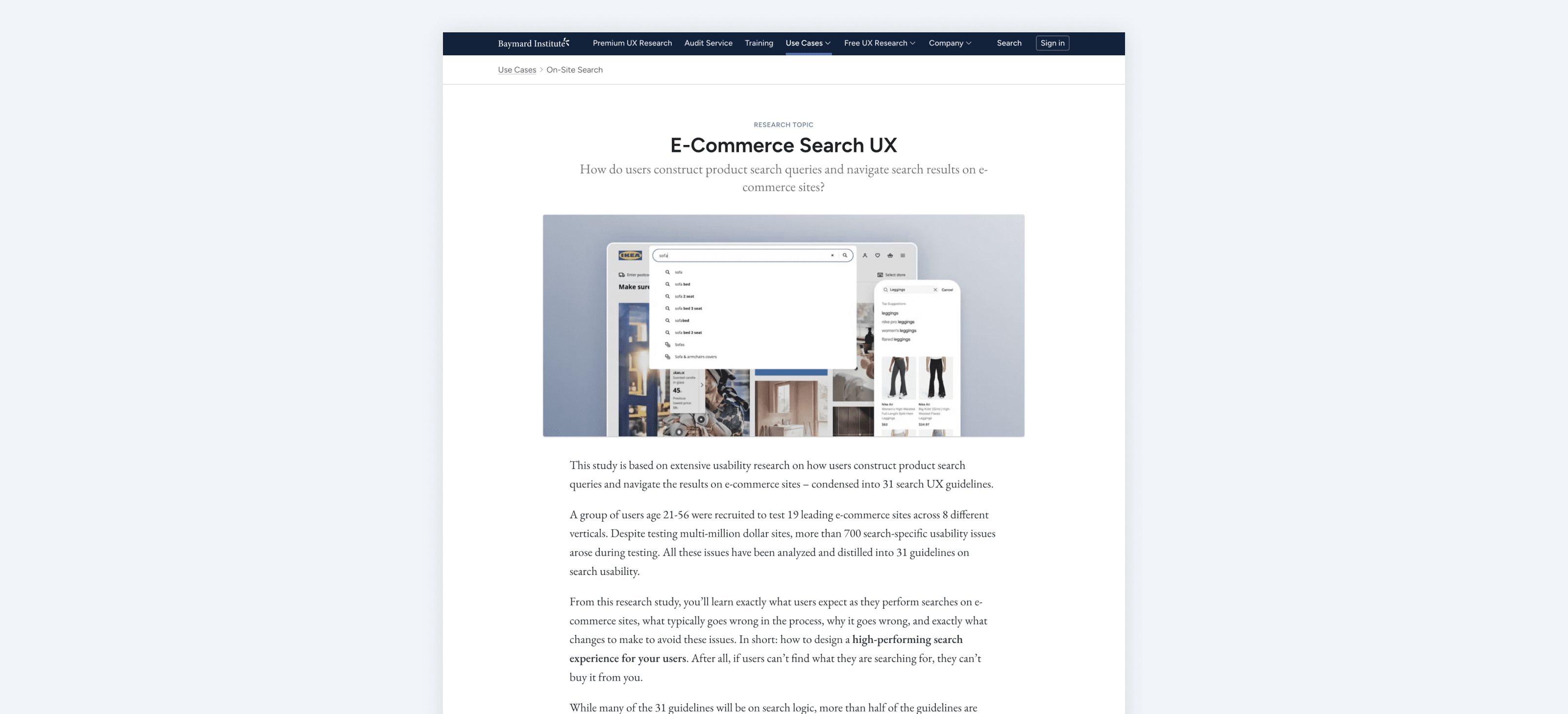
I also looked at how other apps — both direct competitors and bigger retail apps — handled search.
On top of that, I reviewed best practices from Baymard Institute to see what’s proven to work well in e-commerce search. This research provided a solid foundation for our decisions, helping us align with established UX principles and identify proven strategies to improve the search experience.
Key Decisions
After conducting research and gathering feedback, the following product decisions were made.
Search bar placement and visibility
Ensure the search bar is easily accessible from key screens and remains visible when scrolling for quick access.
Display popular and trending searches
Showcase trending or popular searches to inspire users and encourage exploration.
Retain recent search queries
Store and display users’ recent search queries to help them quickly revisit previous searches without retyping.
Implement effective autosuggestions
Introduce an autosuggest feature that offers relevant suggestions as users type, helping them find items faster and stay focused on their intent.
Preserve search queries after submission
Ensure the original search input remains visible in the search bar after submission. This helps users refine their search without retyping their query from scratch.
Correct typos automatically
Integrate typo detection and correction to assist users in finding relevant products even if they enter incorrect search terms.
Display the number of search results
Show users the total number of matching results to help them gauge the effort needed to browse through available options.
Avoid ‘no results’ dead ends
Instead of blank pages, suggest related items or alternative search queries when no exact matches are found.
Provide accurate and relevant results
Search results should prioritize relevance and accuracy to help users find what they need quickly. The most relevant items should appear on the first page.
Out of scope
Some features were left out of scope due to their complexity and were planned as standalone projects:
Filters and sorting
This feature was too large to fit within the scope of the project and was prioritised for future development.
Android and web apps
The team chose to experiment on iOS first, the most popular platform, before expanding to web and Android if successful.
Search results layout
Search results should prioritise relevance and accuracy to help users find what they need quickly. The most relevant items should appear on the first page.
Design
Search bar placement and visibility
The search bar has been improved by placing it prominently on key screens and ensuring it remains visible while scrolling. This enhancement makes it easier for users to locate and use the search function without unnecessary effort.

Trending searches
Popular search suggestions have been introduced to inspire users and encourage exploration. This enhancement helps users discover trending items and engage with the app even when they don’t have a specific product in mind.

Recent search queries
Recent search queries have been introduced to help users quickly revisit previous searches without retyping. This improvement enhances convenience and encourages repeated engagement with the search feature.

Autosuggestions
An autosuggest feature has been implemented to provide relevant suggestions as users type, helping them find items faster and stay focused on their intent.

Preserve search queries after submission
The search input now remains visible in the search bar after submission, allowing users to refine their search without needing to retype their query from scratch.

Display the number of search results
The total number of matching results is now displayed, helping users gauge the effort needed to browse through available options and make informed decisions.

Spell Correction
Typo detection and correction have been implemented to help users find relevant products even if they enter incorrect search terms, ensuring a smoother search experience.

Improved ‘no results’ page
The ‘no results’ page has been enhanced with an “Other options to consider” section, featuring flash sales, new arrivals, and trending items. This update helps users explore relevant products even when their initial search doesn’t yield exact matches.

Accurate and relevant results
Search relevancy has been significantly improved by refining the ranking algorithm to consider multiple parameters, each with a different weight, ensuring users find what they need quickly.
The most relevant items are now prioritised and appear first, enhancing the overall shopping experience.
For example, if a user searches for “black jeans,” search results are ranked based on:
- Exact match – Items with “black jeans” in the title rank highest.
- Popularity – Frequently bought jeans appear at the top.
- Ratings – Higher-rated products rank above lower-rated ones.
- Availability – In-stock items show before limited or out-of-stock options.
- etc.

Results
38
Increased user retention on mobile
Following the search experience improvements, only 38% of users exited the app within the first two minutes, indicating a significant reduction in frustration and improved content discoverability.
52
Higher search engagement
Search usage increased to 52%, showing that users found the feature more accessible and intuitive, leading to greater adoption and interaction.
24%
Reduced search drop-off
Search drop-off decreased to 24%, demonstrating improved trust in the search results and a better alignment with user expectations.
Key takeaways
This project reinforced the importance of a user-centered, data-driven approach to improving search functionality. By combining qualitative feedback with quantitative data, collaborating across teams, and benchmarking industry best practices, we successfully enhanced the search experience and drove meaningful improvements.
- Collaboration is key: Close teamwork between design, product, and engineering ensured feasible and impactful solutions.
- Balancing scope and priorities: Some features were deferred for future implementation, highlighting the need to focus on high-impact improvements first.
- Data-driven design works: Using research insights to guide decisions led to measurable improvements in user engagement and satisfaction.